Branding designed by Daniel Gurwin. Photography by Maria Palermo.
Palermo Photography
Palermo Photography is a Pittsburgh based wedding photography company run by Maria Palermo. Maria was already working on a fresh start to her brand with the Indigo Project and Daniel Gurwin but needed a way to bring that new brand to her website. She felt like she had outgrown her current branding and website and wanted something fresh and fun to match her personality.
Client Goals
Update the design that matched to feel more like her brand.
Attract more of the "right" client.
To showcase her work is a personalized way. She doesn't just photograph your special day, she's a wedding photographer and organizer all in one.
Current website design was lacking and didn't have a place to showcase each wedding story.
Challenges
Creating an interesting layout that showcased her work but also differentiated her from other wedding photographers in Pittsburgh.
Selling the product of Sunday Funday - This isn't your grandmother's glamour shot.
Making it easier for clients to reach out and making it easier for Maria to get more information up front by creating a smoother on-boarding process.
Responsibilities:
Website Design
Strategy
User Experience
Project Management
Wireframes & Strategy
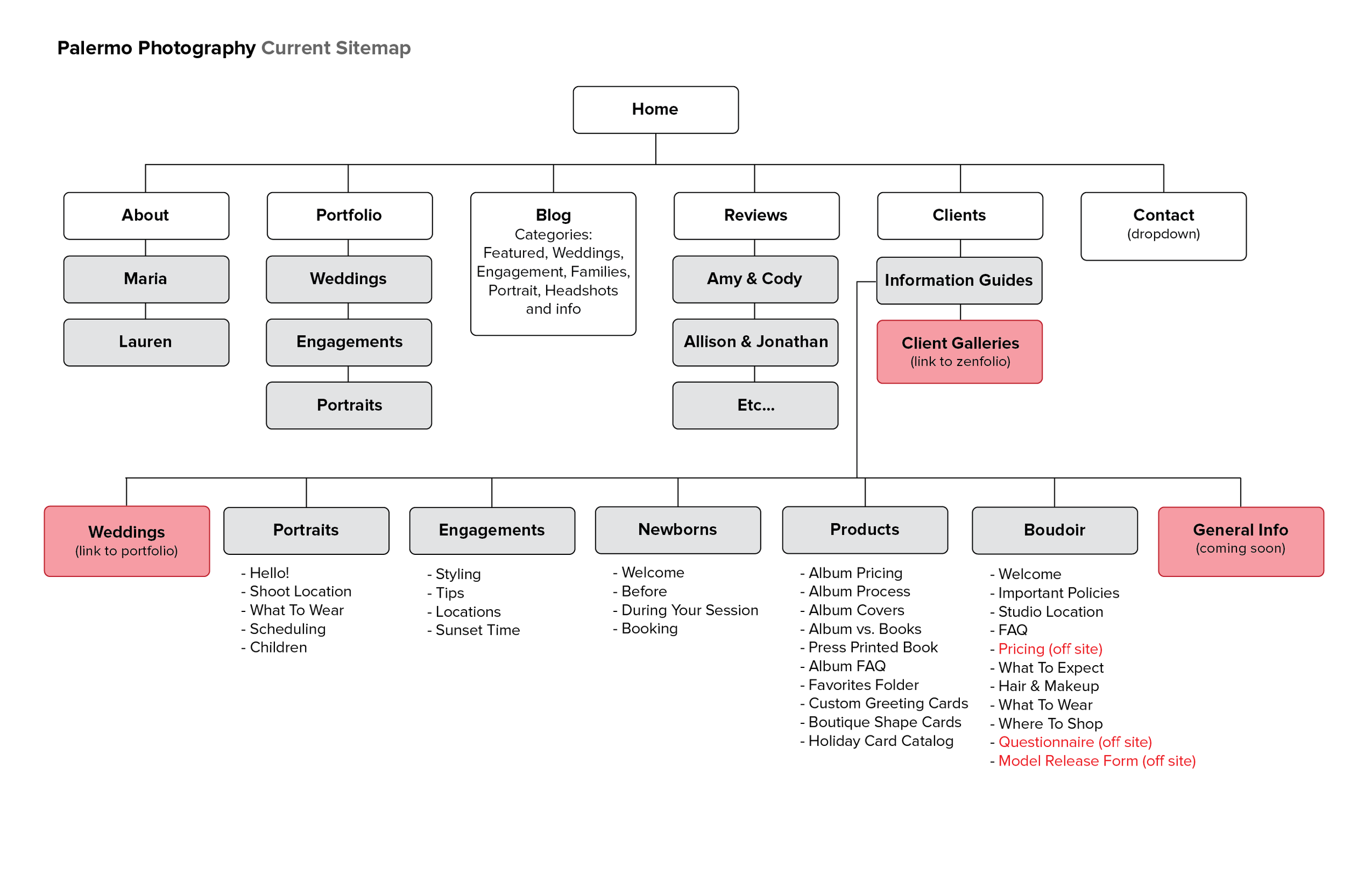
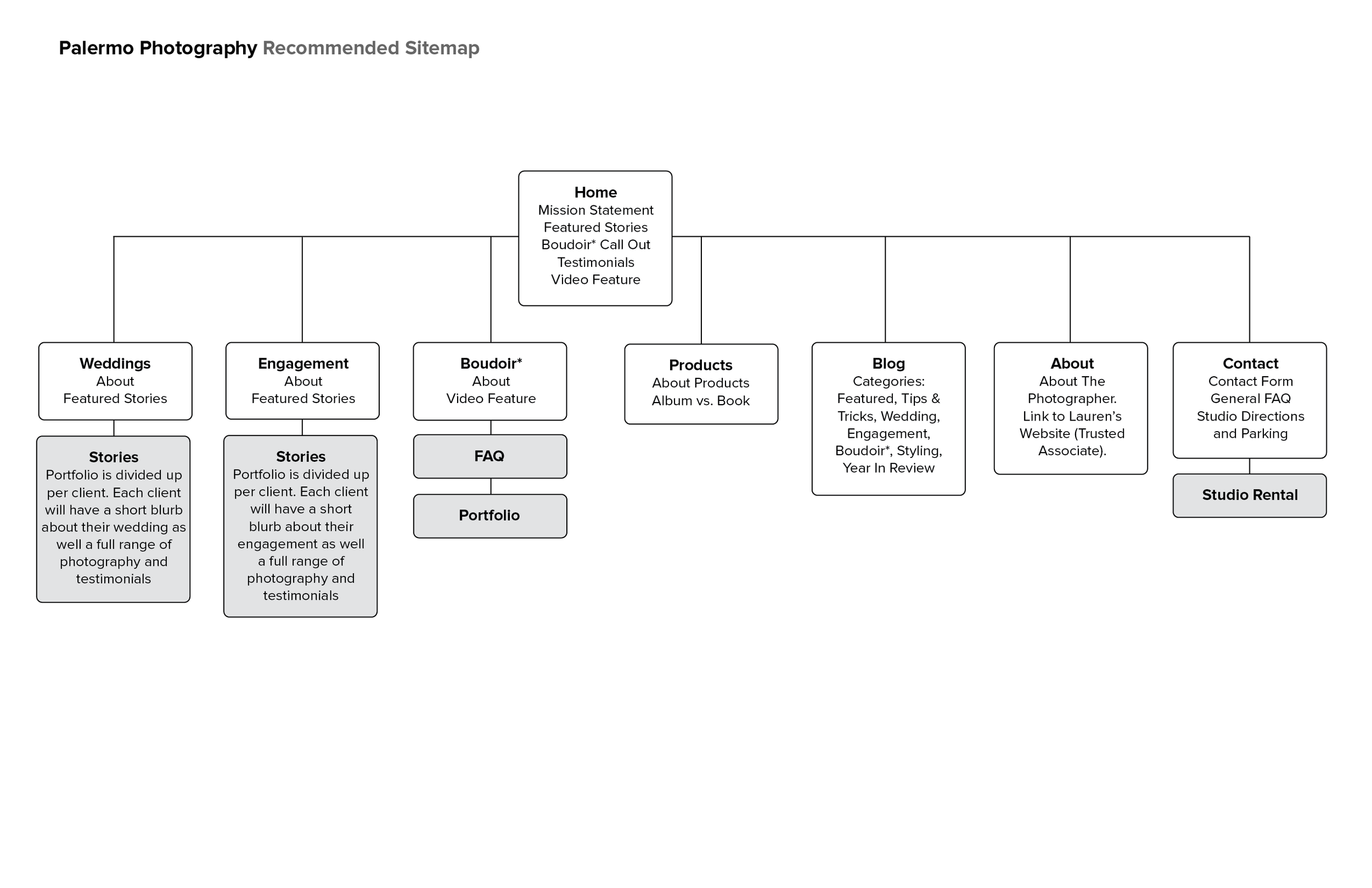
Sitemap Recommendations
Addressed several issues with the current sitemap including links that were currently not working or were not yet developed.
Wireframes
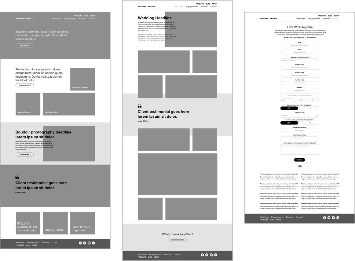
Maria is big on details. She never wants to miss a thing during the weddings she shoots and I wanted to make sure the website conveyed that by showcasing the wedding as whole. The layout needed to be flexible so Maria could choose which layout worked the best for each wedding and to accommodate both large horizontal shots and portrait shots.
In addition to the stories page we did a huge overhaul on her contact page. A wedding photographer’s life is a busy one so I wanted to make it easy for Maria to get the information she needed from potential clients without needing to follow up multiple times. The form is dynamic and the fields change depending on what service your interested in.
Design
Using element collages I was able to quickly come up with some different directions we could go in based on her branding and review with Maria before going into design.
Homepage Design
In the end Maria choose to go with a much simpler color palate that complimented the tones she captures in her photographs. I injected some personality into the design through the use of fun animated icons throughout the website.
